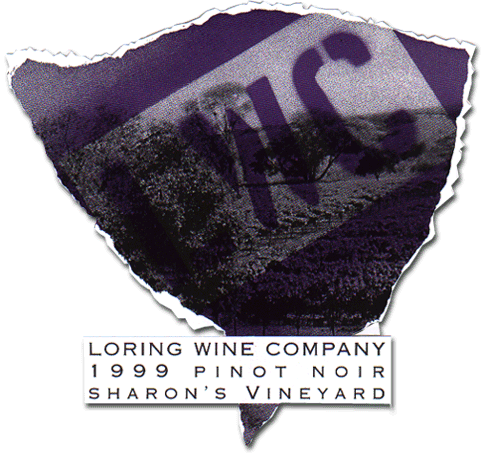
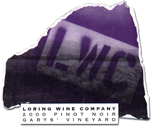
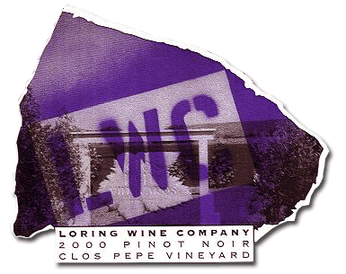
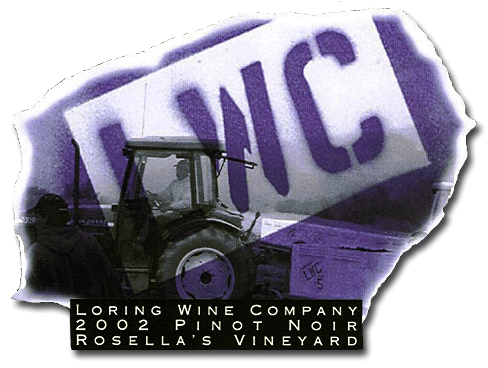
Interesting
labels here, with spray-paint letters over a subtle b&w vineyard scene.
The characteristic torn-look is still there in the 2nd vintage. But, the
label shape has changed and "LWC" now tilts the other way. I
dunno, is it me, or does the '99 look like Brazil and the '00 look like
NY State? And, what about the '00 Clos Pepe - what State is that? Looks
like a butterfly to me. Actually, the "theme" here is each of
the backgrounds contain a vineyard shot of the respective vineyard bottling.
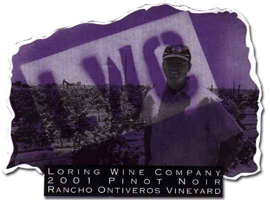
Moving right along, the Loring "theme" for '01 switched to winegrowerw as a background, with "vineyard tractors" for the '02 labels. Family portraits will be the theme for '03.
Copyright © 1993 - 2004, Eric Anderson - All rights reserved
No original material may be reproduced without written consent Mail - Comments - Eric Anderson 
|